This chapter formally introduces the concepts and terminology for the user interface (UI) of the Graphite editor. You may skip to the next chapter if you're familiar with the general layout and terms used in industry-standard graphics editors.
Title bar
The bar running across the top of the editor is called the title bar. In the (forthcoming) desktop release of Graphite, this acts as the draggable window frame.
Menu bar
On the left, the menu bar provides quick access to many editor, document, and artwork related controls. Its functions are covered in detail on the next page.
Window buttons
On the right (and on Mac, the left), the window buttons provide platform-specific controls for the application.
| Web | Fullscreen:
|
| Windows | Minimize, maximize/restore down, close:
|
| Linux | Minimize, maximize/unmaximize, close:
|
| macOS | Close, minimize, fullscreen:
|


Workspace
The workspace is the editor's main content area, filled with panels arranged next to one another. The gutter lines, located between neighboring panels, may be dragged to resize them.
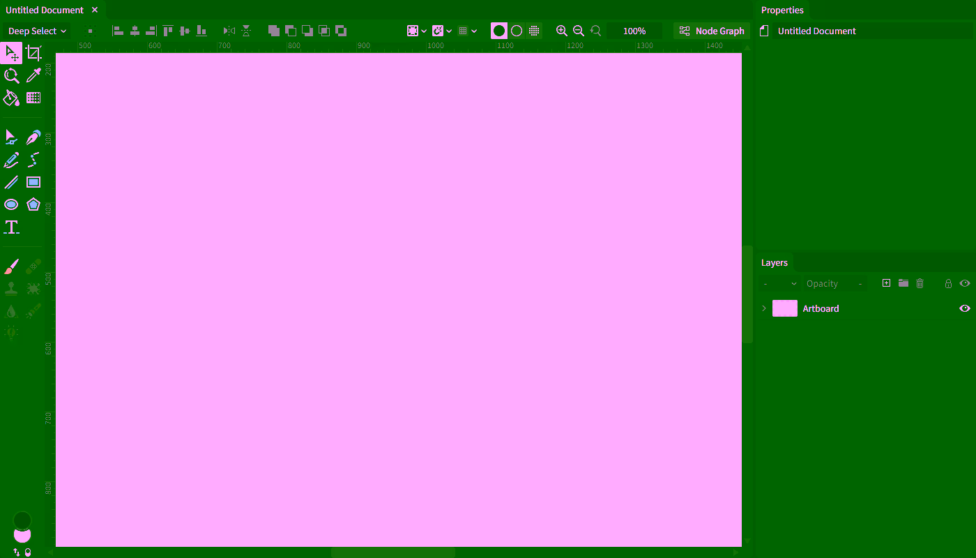
Panels
Panels are regions of the UI dedicated to a specific purpose. Document, Properties, and Layers are presently the three panel types.
Each panel name is shown in its panel header. Panel tabs offer a quick way to swap between multiple panels occupying the same area (currently only documents support this).
Down the road, these tabs will be dockable so the default layout may be customized.
Beneath the panel header, the panel content displays the content for its panel type. Each will be described in the following pages.
Status bar
The bar running across the bottom of the editor is called the status bar.

Input hints
The input hints are presently the only occupant of the status bar. They indicate what common keyboard and mouse inputs are valid in the current context. Hints change with each active tool as well as with the current interaction state. Keep a frequent eye on the hints to discover more features as you work.
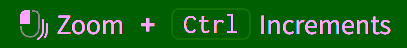
Hints with a + mean that adding the indicated modifier key will change the base action. For example: in the following action, dragging with left-click held down will zoom the canvas; then additionally holding the Ctrl key will make the zoom action snap to whole increments.
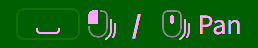
Hints with a / mean that either indicated input combination can be used to trigger the same action. For example: in the following action, either holding the space bar while dragging with the left mouse button held down, or just dragging with the middle mouse button held down, will both pan around the document in the viewport.
The following chart describes each icon representing the mouse inputs you can perform so a hint's prescribed action occurs.
| Clicks | Drags | Others | |
|---|---|---|---|
| Left mouse button |  Left click |  Left click drag |  Left double-click |
| Right mouse button |  Right click |  Right click drag |  Right double-click |
| Middle mouse button |  Middle click |  Middle click drag |  Scroll up/down |
| No mouse button |  Drag |